A structured process from discovery to delivery.
The design work followed a structured human-centred design process and methods spanning four phases: Discover, Define, Develop and Deliver. This timeline served as the backbone of the project, guiding our activities and ensuring research findings flowed into design decisions.

Process map — 14 iterations across Discover, Define, Develop and Deliver phases.
My role: UX Researcher and Product Designer. I led end-to-end research, facilitated workshops, synthesised findings and designed all three dashboards in close collaboration with engineering, product and QA.
Confidentiality: This case study is based on work I did for a MedTech client and reflects my actual contributions. The product name has been changed to respect confidentiality obligations. The research methods, design decisions and outcomes described are real.
Understanding the problem no one had named.
Direct access to patients was heavily limited by regulation, so before designing anything, I needed to understand the problem through the people closest to the work. I began with secondary research, reviewing academic studies on patient dropout in clinical trials, mostly in oncology, to help the team see both the scale of the issue and what was driving it. Again and again, the same pattern appeared: the warning signs were often present long before a patient dropped out, but the tools were not helping staff notice them early enough.
Before speaking to clinical staff, I ran a workshop with the team to map the patient journey as we currently understood it across four trial stages — onboarding, waiting, treatment, and post-treatment — and to capture our early assumptions about the patient experience at each stage, including where concerns, needs, and possible pain points might arise. This helped align the team around the context and clarified what needed to be explored further through qualitative research.

Interview with Clinical Expert, learning the user journey across all stages of a clinical trial.
Since direct access to patients was restricted early in the project, I worked closely with a trial physician and a nurse to build an initial understanding of the context. Through semi-structured interviews, I explored their perspectives, workflows, pain points, compliance challenges, and how they compensated for gaps in their existing tools. Later in the process, together with another researcher, we interviewed three additional clinical experts to test and refine our early assumptions.
"By the time I notice a patient hasn't logged their symptoms for a week, they've already mentally checked out. I need to see these patterns forming, not discover them after the fact."
Clinical Trial Manager, interviewed October 2024
01
Reactive, not proactive
Clinical staff only discovered engagement issues after patients had already disengaged, missing the window for early intervention.
02
Data overload
Spreadsheets full of raw compliance metrics provided no context or prioritisation, making it hard to focus efforts.
03
Manual monitoring
With 50–100 patients per study, manually checking each patient's activity was time-consuming and error-prone.
04
No action guidance
Even when problems were identified, staff lacked clear recommendations on what to do next.
Working backwards from calm.
To make sense of the data, I used affinity mapping to identify patterns and develop a persona based on a senior trial manager. Earlier in the project, the team had created a proto-persona in a workshop to form a shared view of who we were designing for. I later refined that proto-persona through interviews into a research-informed profile grounded in real behaviours and clinical context.

User persona, Clinical Trial Manager. Final version, refined from the initial proto-persona through expert interviews.
I kept the journey structure we had created early on, mapping the user experience across the main stages of a clinical trial — pre-trial planning, recruitment, execution, and close-out. It helped reveal where stress built up, where relief appeared, and where the biggest pain points sat, including recruitment bottlenecks, compliance burdens, and heavy reporting tasks. From that work, four design principles emerged.
01
Centralise
One place for all critical information across all trials: no more context switching between fragmented systems.
02
Predict
Identify risk before it becomes a problem: showing trends and patterns, not just isolated data points.
03
Customise
Every manager has different priorities. They should have control over wht they see. The system should adapt to the user, not the other way around.
04
Earn trust
Managers would not act on a number they could not question. The underlying signals needed to stay visible one level down
From whiteboard sketches to shared direction.
For the purpose of the brainstorm session I brought together software engineers, the product owner, business stakeholders, a cognitive researcher and the QA lead, everyone whose work would be shaped by what we decided to build. The goal was not to present a finished direction for approval, but to shape it together and build shared ownership.
Through that discussion, two distinct views of the Trial Dashboard emerged: a General Overview, where managers overseeing multiple trials could see all of them in one concise summary, and a Trial Management Dashboard: a dedicated workspace for each trial showing the key metrics that indicated whether a trial was stable or drifting toward risk.

Brainstorm session with the team - Workshop 2
Once the first prototypes had been developed in close collaboration with the Product Manager and the information architecture had reached a stable enough point, I moved into early usability testing to understand how the direction held up in practice. These sessions were not only about validating the structure, but also about catching the kinds of interaction details that could quietly shape confidence, stress, and decision-making in use.
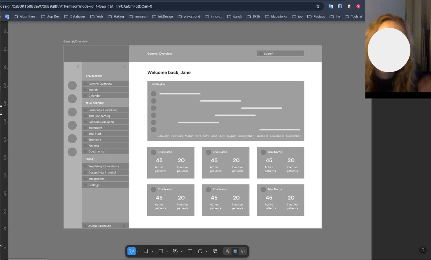
Low-fidelity wireframes — exploring information architecture and navigation structure with the team.
In the final round of prototypes, we put more emphasis on giving users control over how information was organised and viewed. In close collaboration with the Product Manager, this influenced both the navigation and the dashboard structure, leading to a more flexible drag-and-drop approach. Usability testing later showed that this worked well for handling complex information and helped users tailor each dashboard to their own needs.

Drag-and-drop menu — designed to support dashboard customisation by giving users control over what is visible and most relevant to them.
One finding from usability testing stood out clearly. An early high-fidelity prototype used red as the primary alert colour, but clinical staff reacted negatively to it. They said it raised their stress levels before they had even read the content, making them slower to act rather than faster. In response, urgency was communicated through small indicators like arrows, status badges, and action buttons, rather than border treatments, keeping the interface calm while preserving the hierarchy of attention.
 After
After
 Before
Alert and notification design — tested with users to balance urgency with cognitive calm.
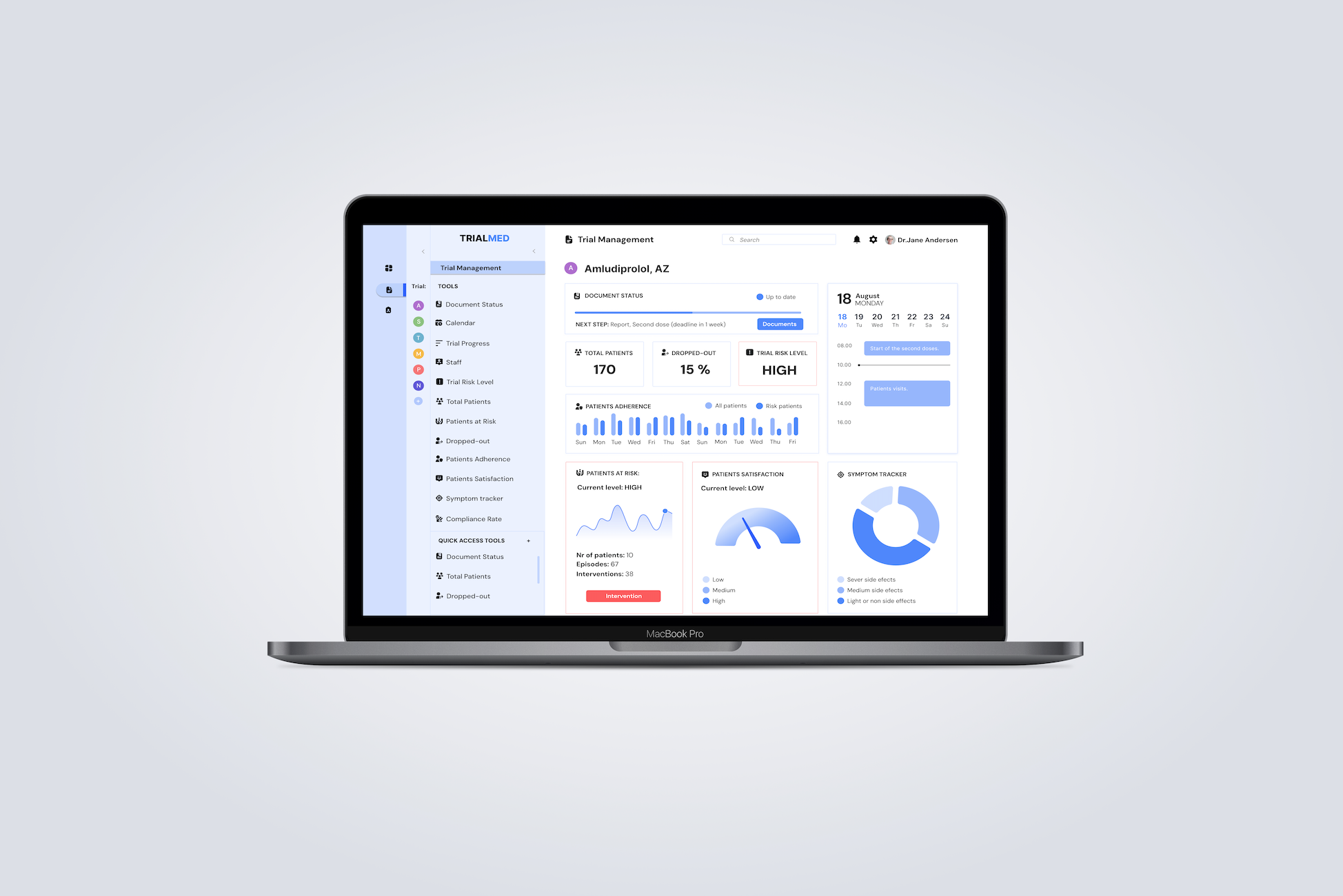
Every decision is traceable.
When I joined, a prototype already existed, built without validated user research. The navigation had no clinical logic. The dashboard was a generic analytics template. The most critical information, patients at risk, was buried at the bottom. There was no early warning system and no compliance tracking. Drag the slider to compare the original and redesigned dashboard.
After
 Before
Drag to compare — original prototype (left) vs final redesign v3 (right).
Early evaluation results
95%
Reduction in manual reporting time
68%
Self-reported cognitive load reduction
5
Participants — directional, not definitive
* Figures based on early evaluation with a small sample of five participants and should be treated as directional. Wider validation with a larger cohort remains the logical next step.
Reflection
If I were approaching this project again, I would involve clinical staff earlier and more frequently in testing and feedback loops. Because access to end users was limited, the early direction leaned more heavily on product and business perspectives. Looking back, earlier contact with clinical staff would have been one of the most valuable ways to balance stakeholder input with real-world use.
The project also taught me something important: in high-stakes environments, trust depends on clarity. Systems need to help people feel informed, capable, and supported, especially when the consequences of confusion are real.