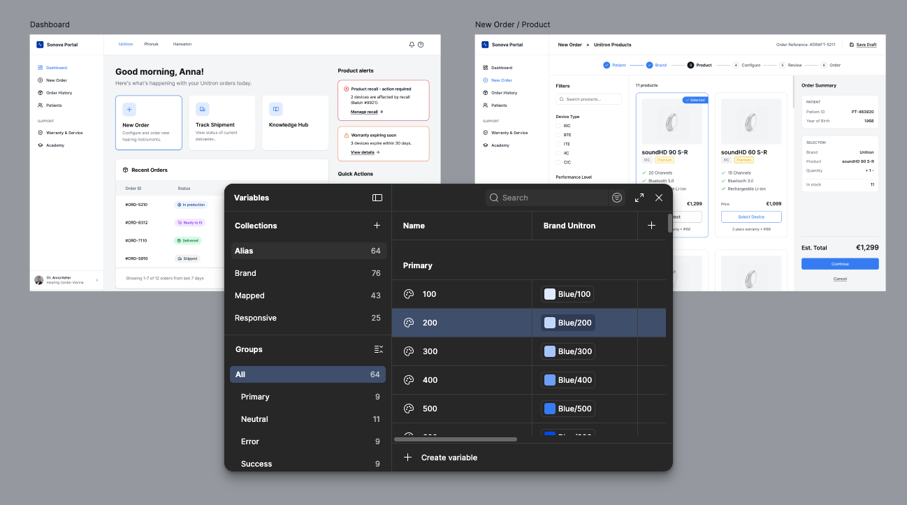
A B2B portal for hearing care professionals built to support real clinic work.
Hearing care professionals juggle complex, high-stakes tasks: ordering instruments, managing patient records, tracking warranties, handling service requests. The assignment was to design a portal concept for Sonova one of the worlds largest hearing care groups addressing pain points around ordering, accessibility, and product knowledge, while building a component-based design system that could hold the product together across multiple brands and portal areas.
The constraint was time. The brief was broad. So I used AI as a prototyping accelerant not a replacement for design judgment.
AI was useful for speed and breadth. But it didnt replace UX judgment: what information matters most, how tasks should be prioritised, where friction occurs, and which patterns should become reusable components.
From brief to rendered interface in hours, not weeks.
I used Figma Make to rapidly explore how the portal could be structured across seven functional areas: onboarding, dashboard, ordering, order history, patient records, warranty/service, and training. The goal was not to let AI make design decisions it was to compress the translation from brief to something visible, so I could evaluate, critique, and structure it properly.
The AI-generated prototype acted as a starting point. I reviewed every screen critically against product logic, realistic B2B tasks, accessibility requirements, and navigation consistency. What you see in the final screens is the result of that refinement not the first output.
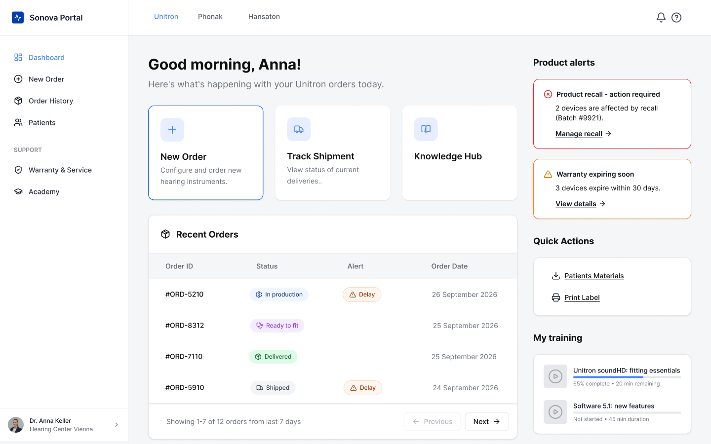
Dashboard, the operational home base
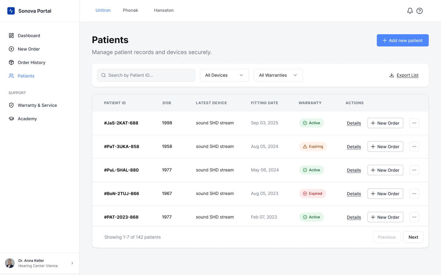
Patients: records, devices, and warranty at a glance
From screens to system, making patterns reusable.
After the prototype established the product surface, I shifted focus from screens to structure. I broke the interface down into repeatable patterns: navigation, buttons, form fields, status labels, cards, tables, alerts, tabs, step indicators, and action panels. Each had to work consistently across the portal and scale to new areas without rebuilding from scratch.
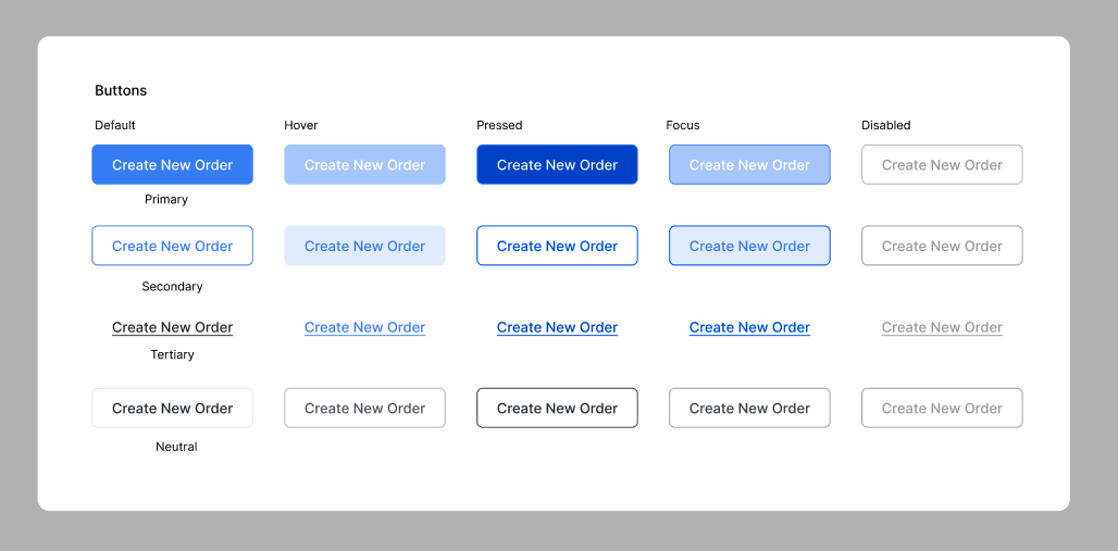
Buttons system
The button system became a particular focus. I designed four variants: primary, secondary, tertiary, neutral, and disabled each with a full state matrix covering default, hover, pressed, focus, loading, and disabled. The system logic is intentional: filled states handle pointer interaction, outlined states handle keyboard focus. Each variant has one fewer visual layer than the one above it.
01
Consistency
Similar actions and states look and behave the same across the portal, regardless of context or portal area.
02
Scalability
New portal areas can be designed without rebuilding patterns from scratch. The system carries the structural decisions forward.
03
Accessibility
Clear hierarchy, readable contrast, visible states, and predictable interaction patterns are built into every component from the start.
04
Hierarchy in practice
One primary action per page. Secondary for supporting actions. Tertiary for utility. The system tells a story the user never has to think about.
The system in context, from ordering flows to patient records.
The ordering flow is where the component system does its most visible work. A six-step stepper guides clinicians from patient selection through brand, product, configuration, review, and order with a persistent summary panel keeping context visible throughout. Button hierarchy is explicit at every step: primary for the forward action, secondary for per-card selection, neutral for reversals, tertiary for escape hatches.
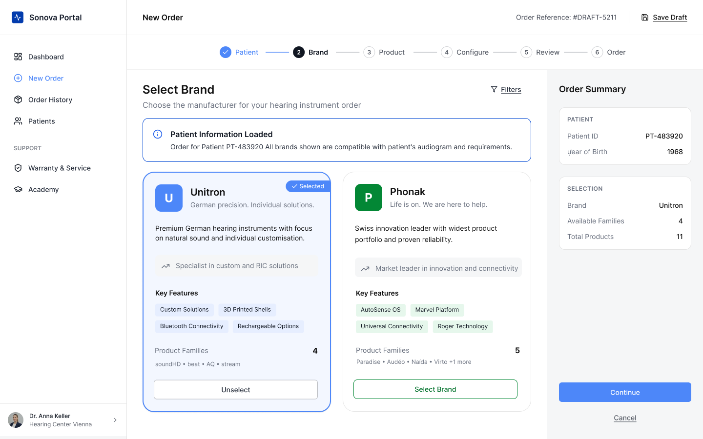
Select brand in order checkout
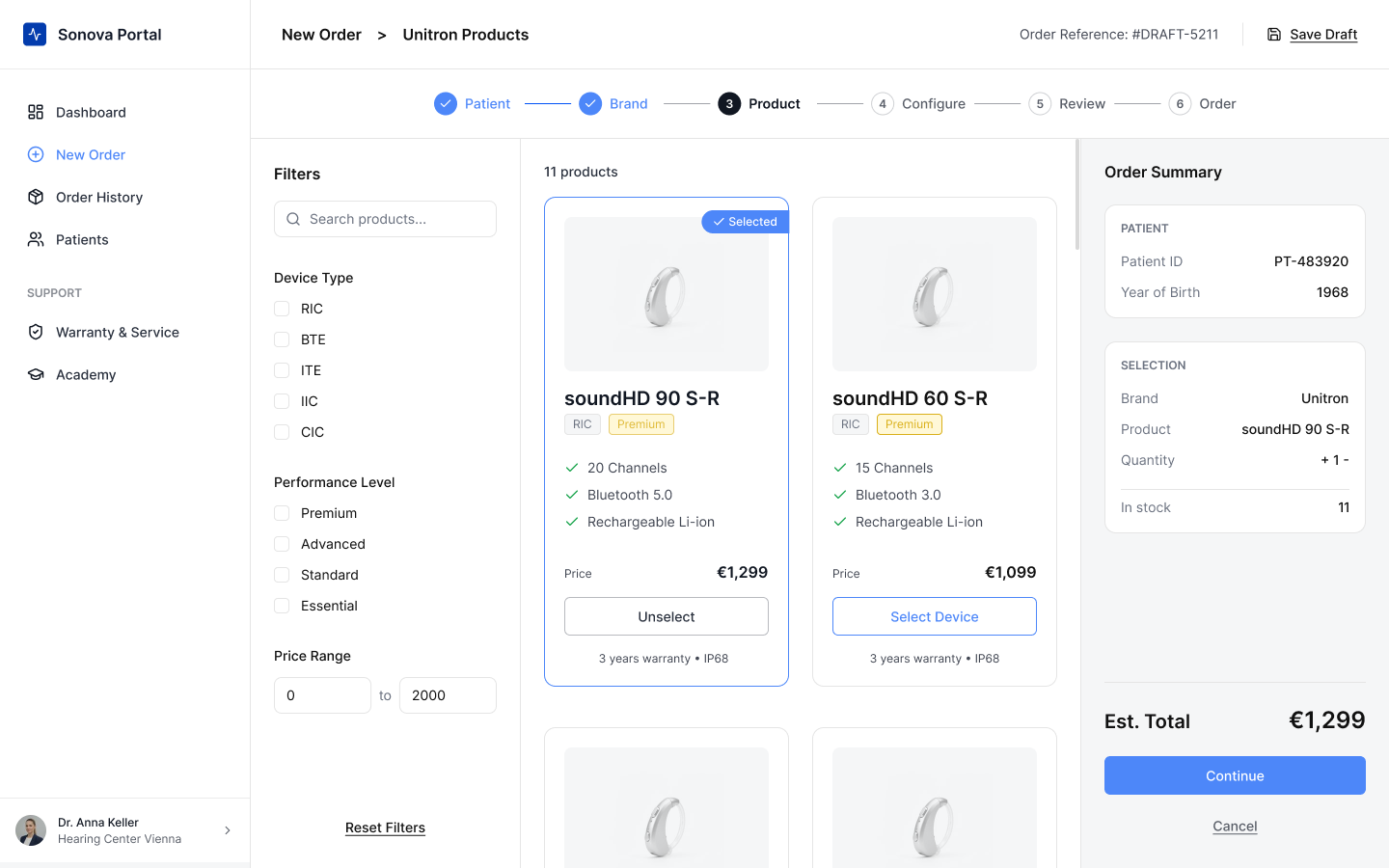
Select product in order checkout
The patient record is where the button system’s disabled state does real UX work. The Repair Request button sits in a disabled state until an issue type is selected, using the button itself as a progress indicator within the card, without a separate status element. The component earns its place by doing two jobs at once.
Four decisions that shaped the whole system.
01
Hierarchy over decoration
Every visual decision: button weight, label color, border treatment, encodes meaning. Nothing is decorative. If an element exists, it communicates something about priority or state.
02
One primary action per page
Competing primaries create confusion. Each screen has a single dominant action; everything else steps down. This applies to the dashboard, the ordering flow, and every service screen.
03
State as communication
Disabled doesn’t mean absent. A disabled button tells the user that something is possible but not yet ready, it keeps the mental model intact while preventing premature action.
04
Components as decisions recorded
Every component in the library is a design decision made once, documented, and reused. Building the system is slower upfront, but every screen built after it is faster and more consistent.
Reflection & next steps
The most important next iteration would be validating the ordering flow end-to-end with actual hearing care professionals, mapping their current process, identifying where the portal creates friction or clarity, and testing the configuration step in particular. The component system provides a foundation, but real workflow validation would tell us whether it’s the right foundation.
I’d also formalise the chip/selection component as a distinct pattern, separate from the button system. The Repair Request card revealed that selection state and action state are related but distinct problems. They share visual DNA but deserve separate component specifications and documentation.