Where UX and engineering speak the same language.
This was a Software Engineering course at IT University of Copenhagen, built around Sommerville's Software Engineering, the same book and methodology I later applied professionally as a systems engineer. The aim was to learn and demonstrate a software engineering process within a chosen framework. Our team of seven picked Agile.
The deliverable was a process portfolio that included stakeholder analysis, risk assessment, sprint planning, use cases, and class diagrams, a structured, well-documented record of methodical engineering thinking.
I was the only designer on the team.
What I discovered early on, and what shaped everything that followed, is that software engineering and UX design share more methods than either discipline usually admits. Interviews. User stories. Rich pictures. Prototyping. Workshops. These aren't UX methods borrowed by engineering, or engineering methods borrowed by UX. They're just good ways of understanding problems and making decisions under uncertainty.
I didn't need special permission to apply a UX lens to those methods. I just needed to recognise that the lens fit.
The high-fidelity screens, the think-aloud usability test, those went further than the course required. But they served the same purpose: making system decisions visible, testable, and grounded in real user behaviour rather than assumption. That's been my instinct in every technical environment I've worked in since. Find the overlap. Work in it. Make it useful.
The problem worth solving.
In 2019, ITU had no mobile app. Not a first-party one, not a third-party alternative. Students navigating four disconnected platforms: LearnIT, MyITU, TimeEdit, and external communication tools, were doing so entirely through desktop interfaces, on whatever device they happened to have.
The cognitive overhead was real. But so was the gap. Nobody had built the thing that should obviously exist.
A mobile app couldn't replace the ecosystem. But it could act as a coherent layer on top of it, surfacing what matters, when it matters, without forcing students to remember which platform holds which piece of their academic life. That was the space we were designing into. Not an improvement. A first attempt at something new.
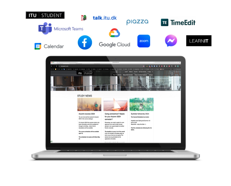 The ITU digital ecosystem in 2019 — many platforms, no coherent mobile layer.
Understanding the problem before designing anything.
We conducted six exploratory interviews with students, lecturers, and administrators. The goal wasn't to validate assumptions, it was to understand how people actually moved through the ITU ecosystem in their daily lives.
What we found was consistent: the calendar was the most critical pain point. Students were manually reconciling information from multiple sources just to know where to be and what to prepare. TimeEdit was particularly frustrating, not because it lacked functionality, but because of its low usability and lack of a mobile-friendly experience.
To validate and prioritise the interview findings, we ran a survey of 85 participants across all user groups. The results were clear: calendar access, course activities, and deadline awareness were the features that mattered most for mobile. Administrative functions ranked significantly lower.
This wasn't a surprising finding. But having the data made the design decisions defensible, not just to the team, but to ourselves.
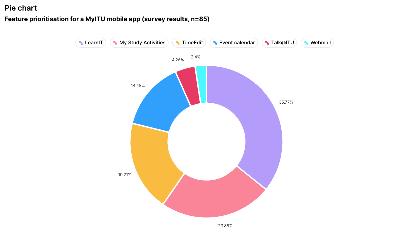 Survey results — feature priorities across 85 participants. Calendar and task management ranked highest for mobile use.
Working within an existing system.
My early career was in branding. Building brand books, establishing visual languages, defining how a brand should look and feel across every surface it touches. That experience shaped how I approached this project from the start.
LearnIT wasn't just a platform. It was a digital product with an established identity, one that ITU's students already recognised and trusted. A mobile app wasn't a new product. It was the same product on a different screen.
I had no access to ITU's design system. So I recreated one that fit the purpose, studying the existing visual language across LearnIT and the student portal, extracting the patterns, and building a component foundation I could design from consistently.
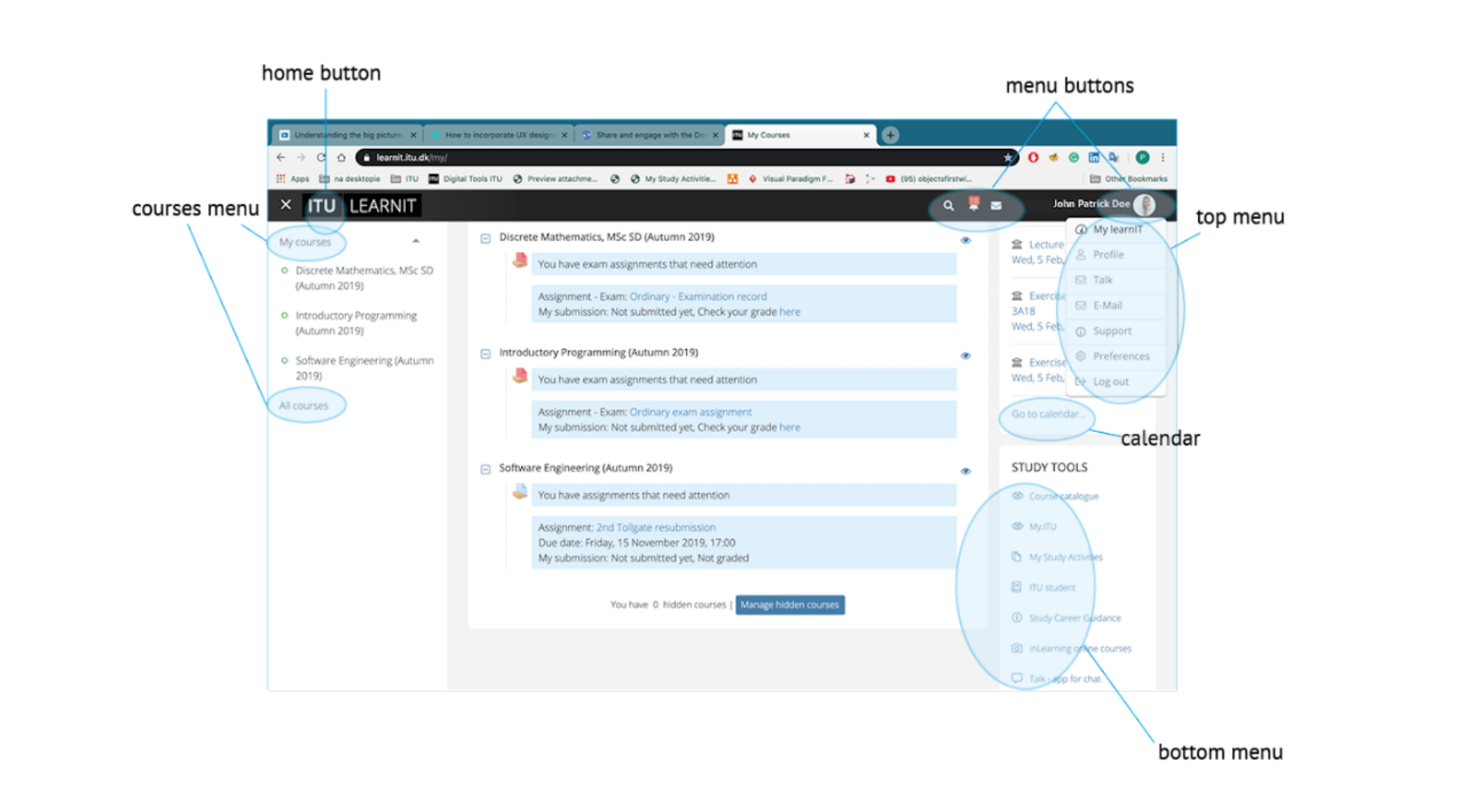 ITU LearnIT information architecture analysis.
I didn't want to invent a single element that wouldn't belong in their established system. Not because I lacked ideas, but because I understood that good brand extension is invisible. The user shouldn't feel the difference between the desktop product they know and the mobile experience they're discovering for the first time.
The calendar and checklist features were the exception, genuinely new interactions with no desktop equivalent. There, I had creative space. Everywhere else, I was primarily interpreting and translating established requirements.
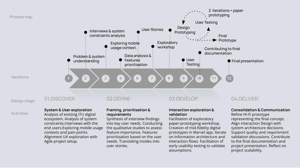 Agile process map which shows where UX methods were introduced across the sprint cycle.
From paper to prototype to people.
I facilitated a paper prototyping session with the full team. Everyone contributed here including engineers, business , all seven of us students of ITU were sitting around a table with pens and paper, sketching screens and arguing about what belonged where. That session mattered not just for the output but for what it did to the team's shared understanding of the product.
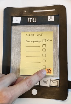 Co-design session: paper prototyping with the full cross-disciplinary team.
We then digitised the prototype using Marvel app, making it interactive enough to support real usability testing. We found two students in the ITU cafeteria and asked them to participate.
It was a think-aloud session. We gave each participant a task, asked them to narrate their thinking as they moved through the prototype, and listened to what was hard, what felt natural, and, critically, whether the feature itself was something they'd actually use.
That last question is one that gets skipped in a lot of usability tests. We asked it deliberately.
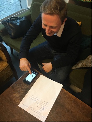 A usability test conducted using the think-aloud method.
The screens.
The final high-fidelity designs were built within ITU's existing design system — maintaining visual coherence with the desktop platform while introducing mobile-specific interaction patterns for the calendar, checklist, and forum features.
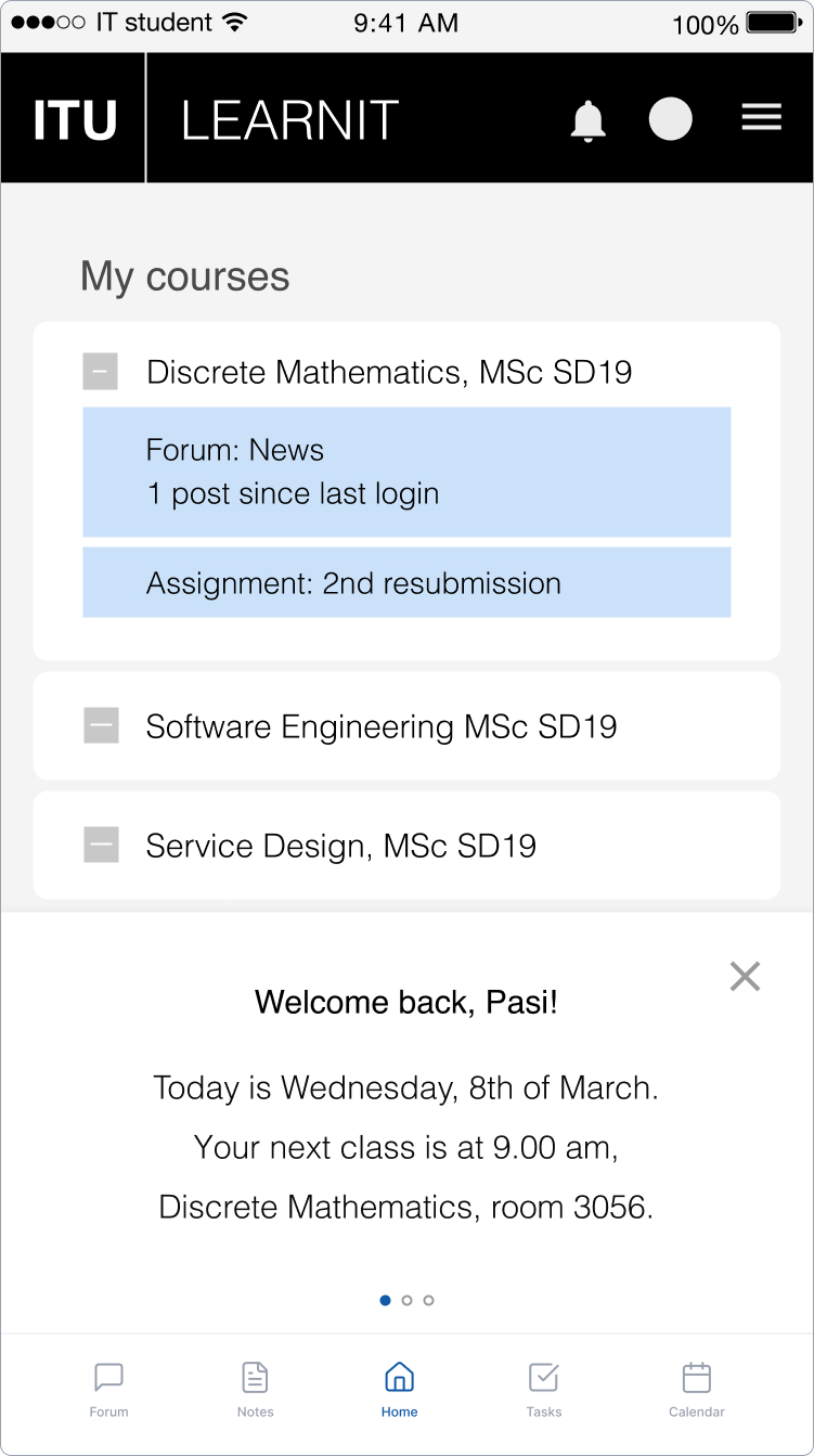
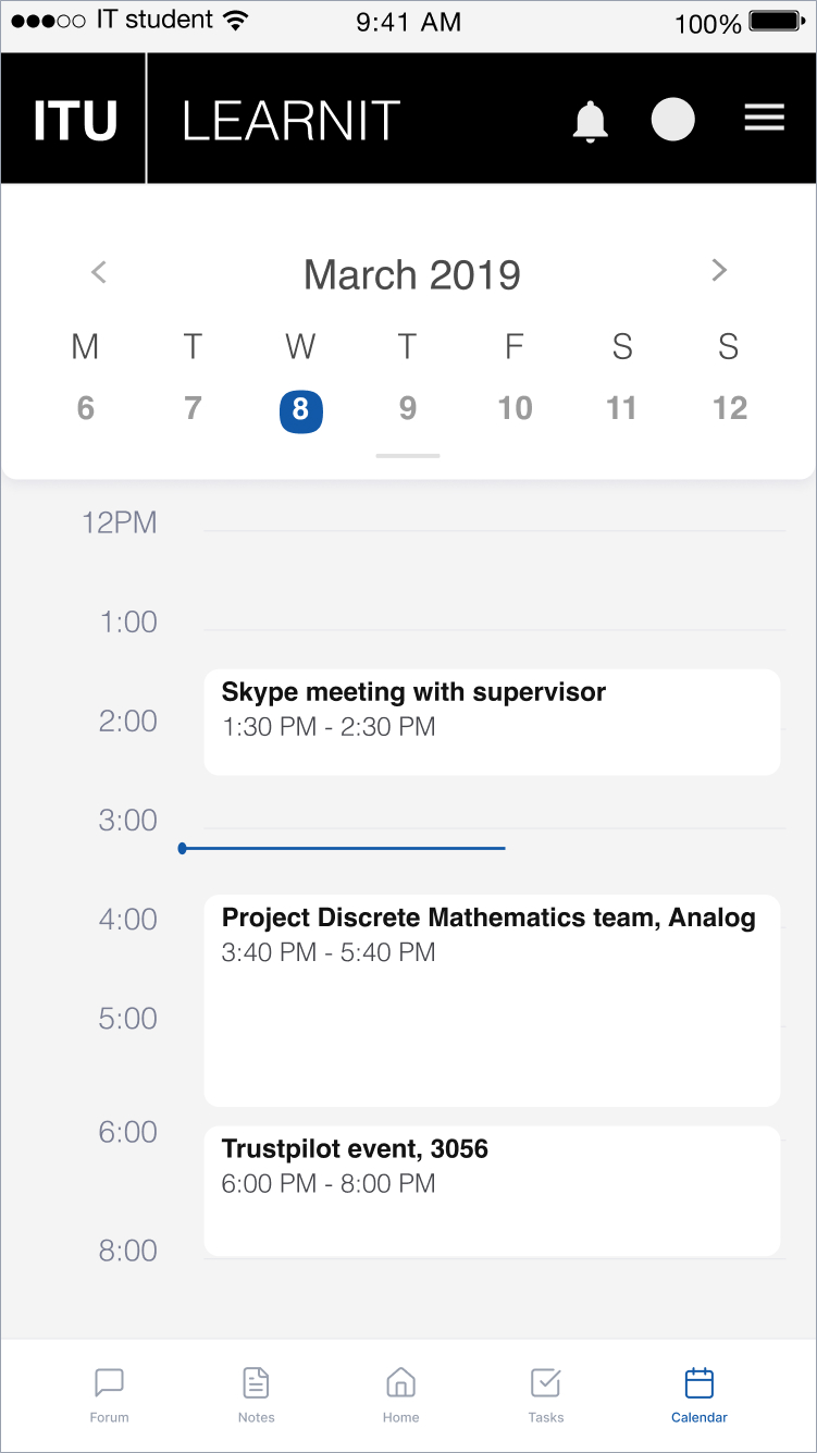
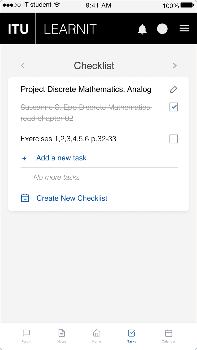
The course asked for process documentation. Stakeholder analysis, risk assessment, Agile planning, class diagrams. All of that is in the report.
What the course didn't ask for was a paper prototyping workshop, a think-aloud usability test, or high-fidelity screens built within ITU's design system.
I introduced all of those. Not to make the project longer or more complicated — but because I couldn't design a system I didn't understand, and I couldn't understand it without talking to the people who would use it.
Working at the intersection of UX and systems engineering taught me something I carry into every project since: the most useful thing a designer can do in a technical team is make the invisible visible. Turn abstract system decisions into concrete interactions. Give engineers something they can react to, argue with, and build from.
That's what I did here. And it's what I've been doing ever since.